I’ve had the fortune to know a lot of talented artists in my day: my aunt was an accomplished painter, my mom majored in art for a time and produced some beautiful work, and even one of my childhood friends is now a celebrated cartoonist and illustrator.
Me, I’m lucky if I can draw a stick figure with the right proportions.
And yet, I somehow keep ending up trying. Back when my first novel came out, I made a terrible sketch that a truly amazing artist used as a jumping off point, yielding the gorgeous cover of The Caledonian Gambit.
When it came time to discuss The Aleph Extraction‘s cover, my publisher liaison Gemma asked me to help fill out a brief about goal for the cover: what it might convey, what imagery or scenes from the book might lend themselves to depiction, and so on.
Luckily, by this point I’d already seen the final cover for The Bayern Agenda1, and I knew that, to me, one of the key things was to keep a consistent visual look and feel with the sequel.
In terms of subject matter, given that the majority of Aleph takes place on a luxury starliner, with one of the key dramatic moments a heist inside a wormhole, I figured that would be something fun to highlight on the cover. And since I’d established in previous books that wormholes are blue/purple on the inside, bringing out those colors in a similar fashion to Bayern‘s red/yellow palette would hopefully produce a similarly eye-catching effect.
So I picked up my iPad and my Apple Pencil and set out to craft another masterful sketch of what the cover might look like. After consultation with my agent, he somehow let me send the publisher this wondrous work of art:
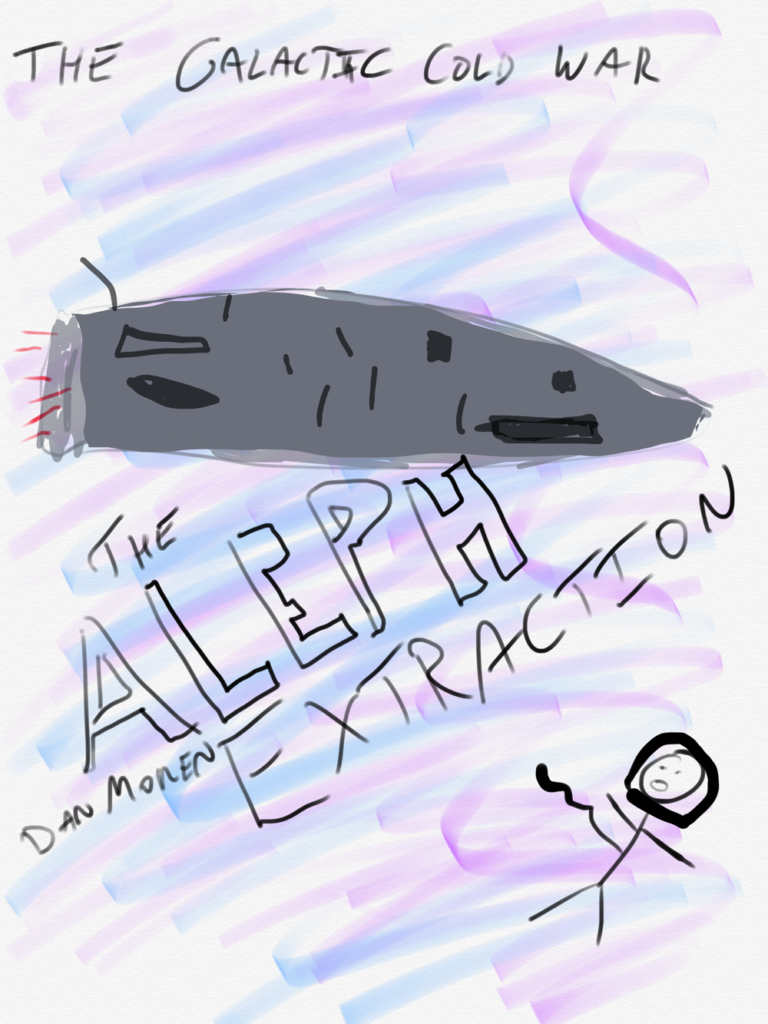
To Gemma’s credit, she did not immediately dissolve into paroxysms of laughter—well, okay, I wasn’t there when she read the email, and I certainly wouldn’t have blamed her. When I showed this sketch to my then-fiancé, she looked at it, then looked at me, then back at the drawing and asked “Is that a…space whale?”2 Other friends to whom I hesitantly showed my sketch offered other, perhaps more untoward comparisons. And that was before they got to the astronaut’s, er, questionable anatomy.3
But no, in her response, Gemma jumped on it, saying “That cover is winner. It’s happening. That’s gonna be it.” And, sure enough, when I got a look at cover designer Georgina Hewitt’s initial pass a couple weeks later, all the basic elements—the wormhole, the spaceship, and the floating astronaut—were there. We made some subsequent tweaks of those elements, including color and image choice, but the composition stayed largely the same throughout the process.4
Authors often don’t get a big say in their covers, and I appreciate having had the chance to give even a tiny bit of input. I’m delighted with the way Aleph looks, and happy to continue my run of having three excellent cover designs for my books.
But I’m probably still not going to learn how to draw anytime soon.
Which, I should note, I provided very little input on. The first I saw of the cover was a handful of mockups, at which point I made some noises about colors, and that was about it.↩
Don’t worry: we still got married.↩
It’s a broken tether cable, people. Get your mind out of the gutter!↩
One disappointment: I loved the pop of the magenta lettering that you can still see on early images, and I think is still the cover of the ebook version, but it turned out that color didn’t translate well to print, which is why the physical copy has more muted lettering.↩